Interactive data visualization using Plotly and Cufflinks
A guide to help analyze data through interactive visualizations using Plotly and Cufflinks.
What are Plotly and cufflinks?
Plotly is a library that is used for creating interactive visualizations o the data. Cufflinks, on the other hand, helps to connect Plotly with Pandas library.
To know more about Pandas, check my article here.
How to install Plotly and Cufflinks?
pip install plotly
pip install cufflinks
How to import packages?
The basic packages like numpy and pandas will be imported along with plotly and cufflinks. We will also import few packages of the plotly offline since we are doing it in the offline mode.
>>> import pandas as pd
>>> import numpy as np
>>> import plotly
>>> import cufflinks as cf
>>> from plotly.offline import download_plotlyjs,init_notebook_mode,plot,iplot
To make sure that the plots are created inside the notebook, write the below code.
>>> init_notebook_mode(connected=True)To make sure that cufflinks can be used offline, write the below code.
>>> cf.go_offline()How to create dataframes?
We will create one dataframe with 150 rows and 4 columns with random values. Another dataframe is made with categorical values. Another dataframe with 3 columns and 5 rows filled with random values. These dataframes will be plotted.
>>> dataset1 = pd.DataFrame(np.random.randn(100,4),columns='a b c d'.split())
>>> dataset1.head()
>>> dataset2=pd.DataFrame({'Key':['a','b','c'], 'Value':[11,22,33]})
>>> dataset2.head()
>>> dataset3 = pd.DataFrame({'a':[11,22,33,44,55],'b':[10,20,30,10,20],'c':[5,4,3,2,1]})
>>> dataset3.head()
How to create line plots?
The interactive line plot is created using the ‘iplot’ method. You can zoom in and zoom out the plot. Hover over the plot to view the values. Also saving the plot as png is an option. You can also click on the column names in the legend to view specific plot of the columns.
The different options to do with the plot can be viewed on the right hand side of the plot. The snippet is given below:

>>> dataset1.iplot()
How to create scatter plots?
The interactive scatter plot is created by mentioning the ‘kind’ as scatter while calling the ‘iplot’ method. The x and y values can also be mentioned according to which the scatter plot is made.
>>> dataset1.iplot(kind='scatter',x='a',y='c')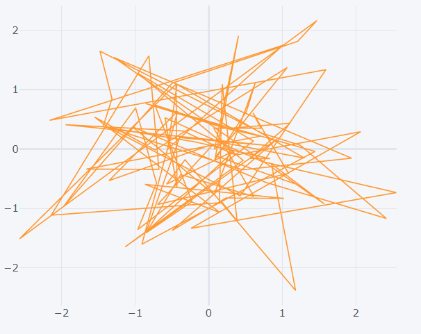
By default plotly makes all the points to be connected by lines. So to view the data points without the connections, mention the ‘mode’ as ‘markers’.
>>> dataset1.iplot(kind='scatter',x='a',y='c',mode='markers')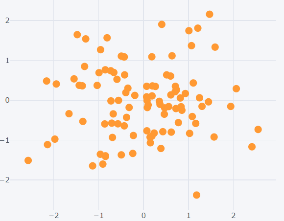
How to create bar plots?
This plot can be created by passing ‘bar’ as the value for the ‘kind’ argument. The x and y axis values are also mentioned.
>>> dataset2.iplot(kind='bar',x='Key',y='Value')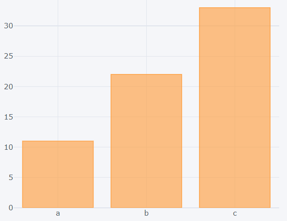
Different functions can also be called on the bar plot like count() or sum().
>>> dataset1.count().iplot(kind='bar')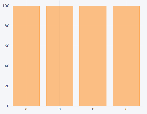
>>> dataset1.sum().iplot(kind='bar')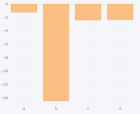
How to create box plots?
By passing the ‘box’ value to the ‘kind’ argument, box plot is formed. The information of the quartiles and median along with minimum and maximum value is shown when hovered over the plot. By clicking on the column names present in the legend, you can choose what to display.
>>> dataset1.iplot(kind='box')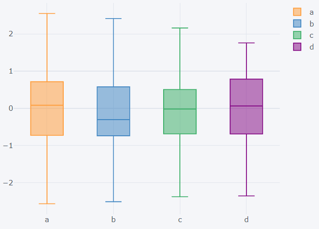
How to create surface plots?
By mentioning ‘surface’ as the ‘kind’, it will create a surface plot. It can be rotated around to view from different angles.
>>> dataset3.iplot(kind='surface')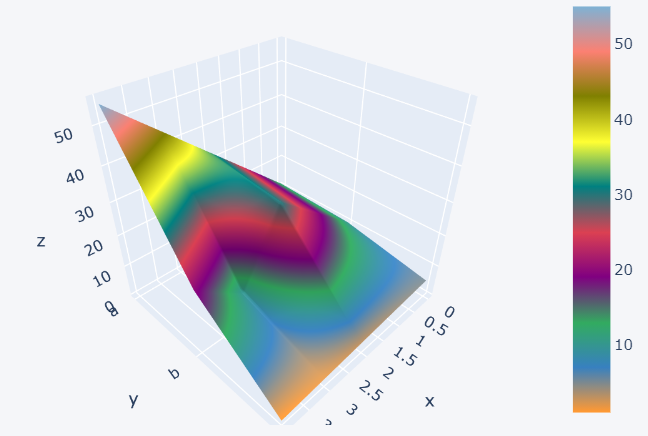
The color scheme can also be changed by mentioning the ‘colorscale’ argument. The abbreviations for few colors are: red-rd, blue-bu, yellow-yl
>>> dataset3.iplot(kind='surface',colorscale='rdylbu')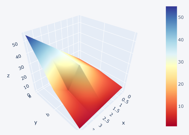
How to create histograms?
Histograms can be drawn for a particular column of the dataset by mentioning the ‘kind’ as ‘hist’. Along with this te bins can also be mentioned.
>>> dataset1['d'].iplot(kind='hist', bins=30)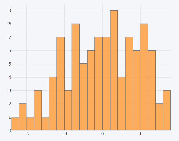
Incase the ‘hist’ is called on an entire dataframe, then the histograms will be overlapping for each column. The selection of columns can be done by clicking on the legends.
>>> dataset1.iplot(kind='hist')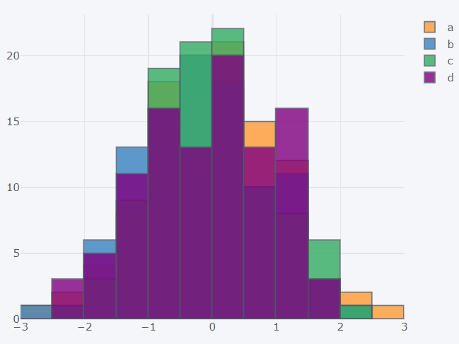
How to create spread plots?
It shows the line plot for the selected columns. Along with this the spread plot is shown, which is made against each other. Normally this is used for stock data analysis. The ‘spread’ keyword is passed to the ‘kind’ argument to create this plot.
>>> dataset1[['a','d']].iplot(kind='spread')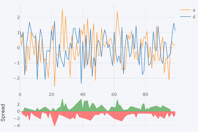
How to create bubble plots?
This plot is similar to the scatter plot. The only difference is theat the size of the marker will change according to a parameter. The ‘kind’ is mentioned as ‘bubble’ to create this plot. The x and y axis values are passed just like in a scatter plot. Additionally the size of the marker based on another column is also mentioned by mentioning the column name to the ‘size’ argument. This kind of plot is used to depict GDP.
>>> dataset1.iplot(kind='bubble',x='a',y='b',size='c')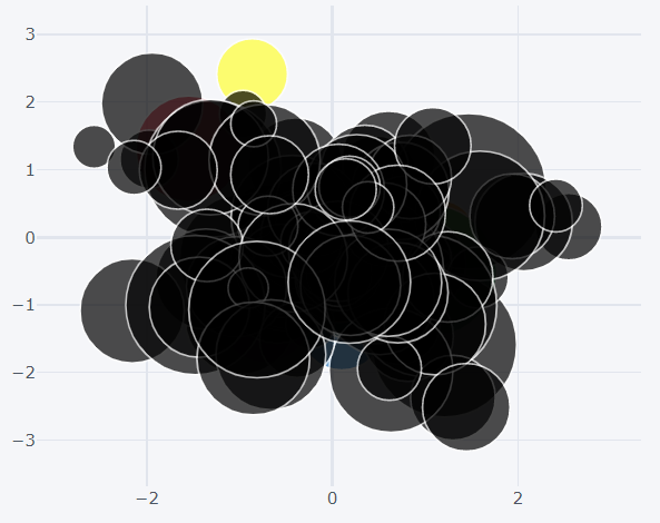
How to create scatter matrix plot?
This plot is similar to the pair plot of seaborn library. The ‘scatter_matrix’ method is called off the dataset. For the scatter matrix to be formed, the columns should be numerical.
>>> dataset1.scatter_matrix()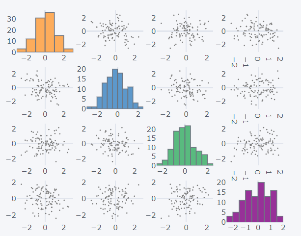
For more detailed information on Plotly and Cufflinks, check the official documentation here and here respectively.
Refer to the notebook for code here.
Books to refer to:
Reach out to me: LinkedIn
Check out my other work: GitHub