Data Visualization
Toyota v/s BMW v/s Tesla: Stock Analysis using Python
A practical implementation of stock analysis for car companies using Python to gain visual and financial insights.
The use of Python is tremendous and it helps in almost every use case. Through this article, I hope to introduce you to using Python in stock analysis. Right from obtaining the data of stocks to visualizing it and gaining insights, everything is explained here. The financial terms are emphasized in simpler terms along with the code for implementation to help understand the concepts better.
To facilitate the process of learning, 3 famous car company stocks are considered: Toyota, BMW and Tesla. These stocks behave differently and help distinguish and gain insights. So let’s get started!
→Importing packages
We will start off by importing the necessary packages and libraries which will be needed for the data analysis and visualization.
import numpy as np
import pandas as pd
import matplotlib.pyplot as plt
%matplotlib inline
Next, we will import the packages necessary for obtaining the data. Pandas DataReader will be used to extract data.
To know more about Pandas DataReader, check out my article below:
import pandas_datareader
import datetime
import pandas_datareader.data as web
→Obtaining data
Now we will obtain the data for the car companies which will be analyzed. The start date and end date will be mentioned and in that period the analysis will be carried out.
start = datetime.datetime(2015,1,1)
end = datetime.datetime(2020,1,1)
Toyota
The car companies which will be considered are Toyota, BMW and Tesla. So the data in the required period is extracted from the web.
toyota = web.DataReader('TM','yahoo',start,end)
toyota.head()
BMW
bmw = web.DataReader('BMWYY','yahoo',start,end)
bmw.head()
Tesla
tesla = web.DataReader('TSLA','yahoo',start,end)
tesla.head()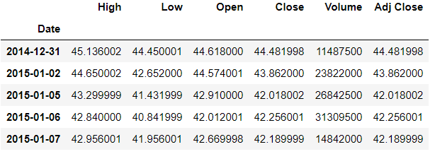
→Visualization of data
The trends in the stipulated time period will be visualized through plots and gain insights. Starting with a linear plot of the open price of all the 3 stocks.
Linear plot
toyota['Open'].plot(label='Toyota',title='Open Prices',figsize=(12,8))
bmw['Open'].plot(label='BMW')
tesla['Open'].plot(label='Tesla')
plt.legend()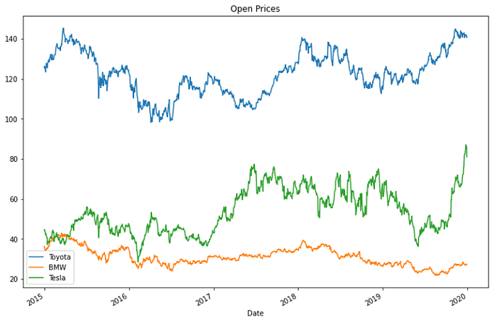
As seen in the above plot, the opening prices for Toyota is high as compared to the other two companies.
Stock volume plot
Next plotting the volume of stock that is traded each day.
toyota['Volume'].plot(label='Toyota',title='Volume Traded',figsize=(12,8))
bmw['Volume'].plot(label='BMW')
tesla['Volume'].plot(label='Tesla')
plt.legend()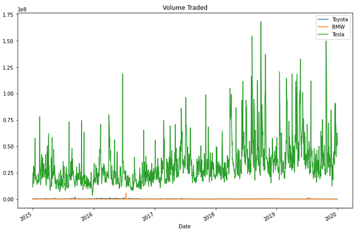
We gain the insight that Tesla had a huge spike reaching a high volume trade somewhere in late 2018.
So let’s find out the exact date when the volume of trade was the highest.
m = tesla['Volume'].max()
tesla.loc[tesla['Volume']==m]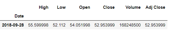
According to the above plots it feels like Tesla has been in a better position than the other two companies. But the clear picture will be seen when not only the stocks are considered but also the total market cap. An easy way to do this is to calculate the total money traded is by multiplying the volume with the open price. So another column is created of ‘Total trade amount’.
Total amount traded plot
toyota['Total trade amount'] = toyota['Open']*toyota['Volume']
bmw['Total trade amount'] = bmw['Open']*bmw['Volume']
tesla['Total trade amount'] = tesla['Open']*tesla['Volume']
Now the total amount traded will be plotted to see its trend.
toyota['Total trade amount'].plot(label='Toyota',figsize=(10,8))
bmw['Total trade amount'].plot(label='BMW')
tesla['Total trade amount'].plot(label='Tesla')
plt.legend()
Here we can observe a huge spike for Tesla somewhere in mid-2018 where a huge amount of stock was traded.
So let’s obtain the exact date it happened.
m1 = tesla['Total trade amount'].max()
tesla.loc[tesla['Total trade amount']==m1]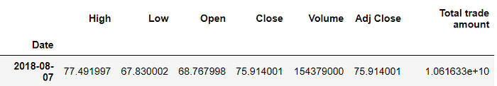
When you search for this date on the web you will find that the surge happened because Elon Musk stated that Tesla may go private.
Just looking into the companies Toyota and BMW since Tesla is on a higher scale.
toyota['Total trade amount'].plot(label='Toyota',figsize=(10,8))
bmw['Total trade amount'].plot(label='BMW')
plt.legend()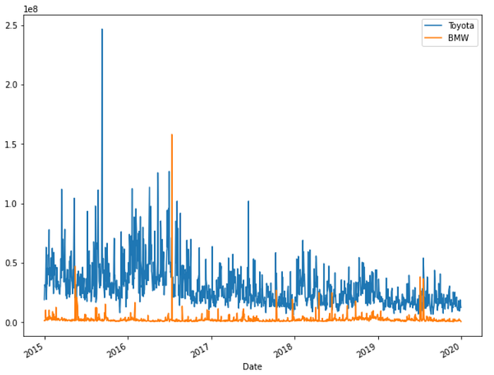
There was a spike for Toyota too in mid-2015 and in mid-2016 for BMW.
Moving average plot
Now let’s move on to plotting the moving averages. Let’s take the BMW data and plot the moving average for 50 days and 250 days.
bmw['MA50'] = bmw['Open'].rolling(50).mean()
bmw['MA250'] = bmw['Open'].rolling(250).mean()
bmw[['Open','MA50','MA250']].plot(figsize=(16,8))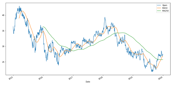
Candlestick plot
While doing stock analysis, the candlestick chart is most widely used. So let’s get to plotting the candlestick chart for the car company Toyota. The mplfinance module is installed. It has a ‘type’ argument that plots candlesticks.
!pip install mplfinanceimport mplfinance as mpf
We extract the dates of the month of May from the year 2016 and plot the candlestick chart for this interval.
toyota_month = toyota['2016-05-01' :'2016-06-01']
mpf.plot(toyota_month,type='candle',style='charles')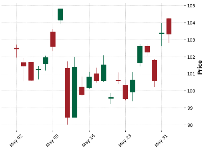
If you want to show the volume traded then just set the argument volume to true.
mpf.plot(toyota_month,type='candle',style='charles',volume=True,figratio=(10,5))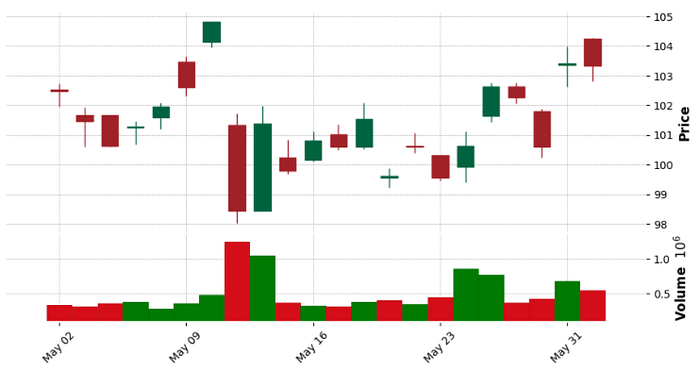
→ Financial analysis
Now we will look into some technical financial terms and their calculations.
Daily percentage return
The first term is the daily percentage change. The formula for it is as follows:
where r(t) is return at time t and p(t) is price at time t. This helps in determining the percentage gain or loss and to analyze the volatility of the stock. Volatility is the measure of the dispersion of the returns from a stock. So if the stock rises and falls more than 1% for a period of time then it is called a volatile market. So when we plot a histogram and the distribution is wide then we can say it's more volatile.
So now a column ‘return’ is created which is calculated using the close price column. For time (t-1), the ‘shift’ method is used to shift down/forward by period 1.
toyota['returns'] = (toyota['Close']/toyota['Close'].shift(1))-1
bmw['returns'] = (bmw['Close']/bmw['Close'].shift(1))-1
tesla['returns'] = (tesla['Close']/tesla['Close'].shift(1))-1
Now we will plot the histogram.
tesla['returns'].hist(bins=100, label='Tesla',figsize=(10,8))
bmw['returns'].hist(bins=100, label='BMW',figsize=(10,8))
toyota['returns'].hist(bins=100, label='Toyota',figsize=(10,8))
plt.legend()
As seen from the above plot, Toyota and BMW are a little stable but Tesla has volatility because it has a wide distribution.
We can get a better insight from the kernel density estimation (KDE) plot.
toyota['returns'].plot(kind='kde', label='Toyota',figsize=(10,8))
bmw['returns'].plot(kind='kde', label='BMW',figsize=(10,8))
tesla['returns'].plot(kind='kde', label='Tesla',figsize=(10,8))
plt.legend()
As seen from the plot, the distribution of Toyota reaches a peak and indicates that it is very stable compared to the stocks of the other two companies.
Now we can compare the returns between the stocks to analyze the correlation between them. This can be done by creating scatter plots. The scatter_matrix method is imported from pandas. To be able to create the plot, we need to create a dataframe with the columns as the returns for each of the stock.
from pandas.plotting import scatter_matrixcomp_df = pd.concat([toyota['returns'],bmw['returns'],tesla['returns']],axis=1)
comp_df.columns = ['Toyota returns','BMW returns','Tesla returns']scatter_matrix(comp_df,figsize=(8,8),hist_kwds={'bins':100})
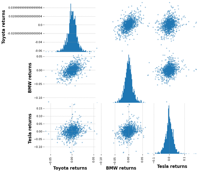
We can draw an insight that there is a correlation between BMW and Toyota but Tesla does not relate to any company.
Cumulative returns
Now we will analyze the cumulative returns. Cumulative means the aggregation of values (here: stock amount) over a period of time. So when considering a cumulative return, it is calculated according to the day the investment was made, unlike the daily return where it is calculated according to the previous day. If the cumulative return is above 1, profit is generated otherwise it’s a loss.
The formula is:
where i(t) is investement at time t and r(t) is return at time t. We will use the pandas ‘cumprod()’ method to calculate it.
toyota['cumulative return'] = (1 + toyota['returns']).cumprod()
bmw['cumulative return'] = (1 + bmw['returns']).cumprod()
tesla['cumulative return'] = (1 + tesla['returns']).cumprod()
Now we will plot the cumulative returns and see which stocks had the highest return.
toyota['cumulative return'].plot(label='Toyota',figsize=(16,8))
bmw['cumulative return'].plot(label='BMW')
tesla['cumulative return'].plot(label='Tesla')
plt.legend()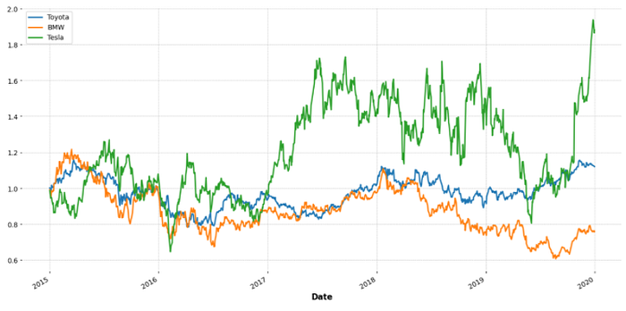
We can assert that Tesla had the largest cumulative return whereas BMW had the lowest return.
We come to the end of the article. I hope you gained an understanding of how to deal with stock data and also understand the trends in it.
Refer to the Jupyter notebook for the full code on Github.
Reach out to me: LinkedIn
Check out my other work: GitHub