Data visualization using Pandas
This article will help you to use in-built Pandas methods for visualizing data and drawing insights.
How to import the packages?
Numpy and Pandas package is imported. Along with this the magic function ‘%matplotlib inline’ is mentioned to make sure that the plots are displayed in the notebook.
>>> import numpy as np
>>> import pandas as pd
>>> %matplotlib inline
For the purpose of understanding, a dataset is taken which has random values.
>>> df1 = pd.read_csv('dataset2.csv')
>>> df1.head()
How to create a histogram plot?
A histogram plot can be generated by using the method ‘hist’ on a column of a dataframe. The number of bins can also be specified.
>>> df1['b'].hist(bins=15)
In case you want to view the plots in the seaborn style then import the package of seaborn, set the style and run the code again.
>>> import seaborn as sns
>>> sns.set_style('whitegrid')>>> df1['b'].hist(bins=15)

How to deal with general plot kinds?
You can also call the ‘plot’ method off the dataframe and mention the kind of plot needed.
>>> df1['c'].plot(kind='hist',bins=10)
You can also call the hist method directly through the plot method.
>>> df1['c'].plot.hist()
How to create area plots?
It plots the area of the dataframe columns. The alpha keyword can be specified to tweak the transparency.
>>> df1.plot.area(alpha=0.7)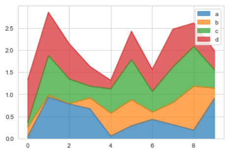
How to create bar plots?
The ‘bar’ method plots the bar plot.
>>> df1.plot.bar()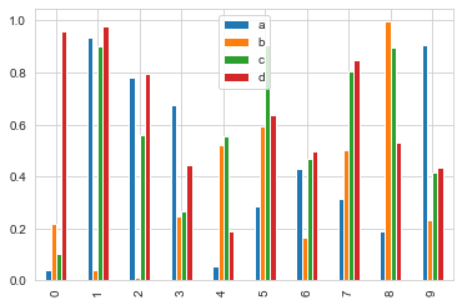
In case you do not want the bars to be plotted separately and instead be stack on each other, pass the value True to the stacked keyword.
>>> df1.plot.bar(stacked=True)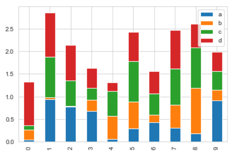
How to create line plots?
A line plot can be drawn by calling the line method and pass the x and y values.
>>> df1.plot.line(y='d')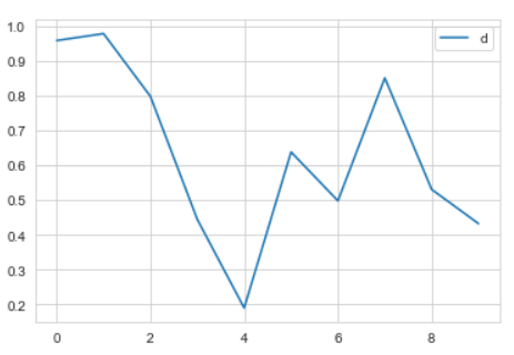
The figure size and line style can also be changed like linewidth.
>>> df1.plot.line(y='a',figsize=(5,3),lw=2)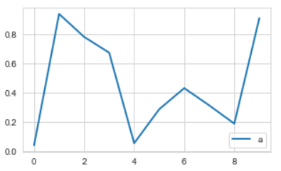
How to create scatter plots?
The scatter method is called and the x and y values are passed.
>>> df1.plot.scatter(x='b',y='d')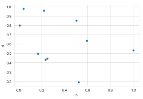
If you want to compare with another column then mention the column name to the ‘c’ value. You can also change the color of the plot using the cmap keyword.
>>> df1.plot.scatter(x='b',y='d',c='a',cmap='rainbow')
How to create box plots?
The box method can be called to create box plots.
>>> df1.plot.box()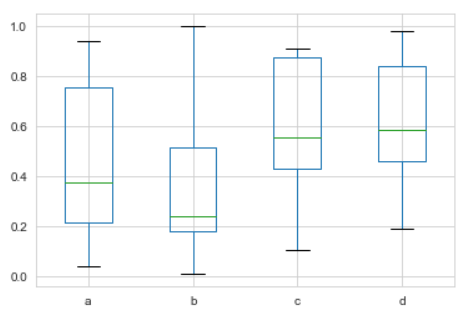
How o create hex plots?
This is just like the scatter plot but the data points are represented as hex cells.
>>> df1.plot.hexbin(x='b',y='d',gridsize=15)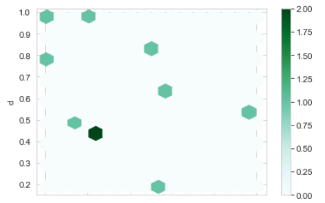
How to create KDE plot?
KDE stands for kernel density estimation. The kde method can be called to plot it.
>>> df1['d'].plot.kde()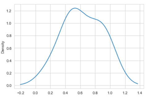
>>> df1.plot.kde()
For more detailed information on Pandas data visualization, check the official documentation here.
Refer to the notebook for code here.
Books to refer to:
Reach out to me: LinkedIn
Check out my other work: GitHub

